It seems like you can’t get through a week without hearing about “Content Marketing” or “Content Strategy”. These strategies call for increasingly complicated pieces of content, including “Big Content”, video, data visualization, photography, and robust design.
Demands for Content are Growing
This progression creates a problem for SEOs. There is a skill gap that exists across a lot of individuals. I think this is linked to the identity crisis we’re going through as an industry. What are we good at? What is our role? What exactly do “SEOs” do in the ever expanding umbrella of “Inbound Marketing”? And why do we keep doing guest blog posts when we know better?
I think this is tied to two issues.
- Doing better has a high cost of entry (budget, time, resources, and skill).
- We often don’t know how to create the stuff we’re recommending.
SEOs can create guest posts in isolation and with little budget. Therefore, this kind of tactic becomes prevalent.
Creating the kind of content we all strive for requires copywriters, photographers, creative directors, graphic designers, videographers, statisticians, marketer researchers, back-end programmers or front-end programers. Creating great content these days requires at least 2 or 3 of these skills to create the content in isolation. Otherwise, content needs to leverage external resources or other team members. This means scope creep, increased costs, and increased time to implement.
This skill gap is dangerous, because we run the risk of becoming glorified project managers.
Many of us can’t execute what we’re recommending.
So in my presentation at SearchFest, I played on the phrase “Technical SEO” to talk about how we should be talking more about being technical in our execution of SEO outside of “Technical SEO”. “Technical SEO” is a subset of SEO with its roots in on-site SEO. As an industry, we learned the skills of front-end code and server configuration. This made sense when on-site SEO played a larger role in the success of organic search. However, the world has changed and continues to change. These days, we should be equally concerned about learning the skills required to execute the style of content we’re recommending. This could include a wide range of skills, but I’d like to speak about the technical side of these skills.
Low Effort, High Impact
A content strategy can be differentiated by tactically being able to create high impact content with relatively low effort (time and cost). One way to do this is to leverage technical skills, libraries, and frameworks to mitigate a significant portion of the heavy lifting.
A low effort, high impact piece of content is something that:
- Has an awesome affect on performance.
- Has a minimal chance of being devalued in future updates.
- Can be created by a single person.
- Creates differentiated content.
This can be achieved via technical leverage.
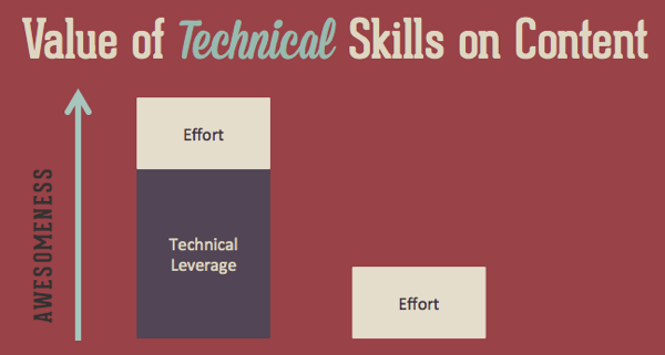
Technical skills are like any tool, in that they can multiple the output of a given unit of effort. The awesomeness of content can be lifted significantly by the application of relatively simple technical tools. For example, both OKTrends and Trulia Trends are given credit for having exceptional content. Both of these sites go after interesting topics, with great writers, but more than that, they’ve managed to differentiate themselves through the use of relatively simple pieces of JavaScript and visualization libraries.
This content can be intimidating for beginner or immediate programmers, but my hope with the rest of this post is to help significantly lower the barrier to entry for creating technical content. My hope is to empower (and encourage) people with a number of tools they can use to step out of the habit of content like static infographics and guest posts.
Most importantly, you don’t have to be good at coding to be successful at this.
The Interactive Infographic Challenge
To hold myself accountable to the same challenge, I set a goal to sit down on a Sunday and in one day build an interactive infographic from scratch, all by myself, using tools I wasn’t familiar with. I could not leverage our engineers or designers.
I wanted to know what I could learn to build, not just what I could project manage.
The goal was not to create the best piece of content, but to build a proof of concept. I gave myself a hard time restraint to build it.
In four hours, I created an interactive infographic.
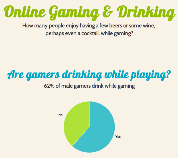
The graphic, although simplistic, is a demonstration of quickly putting together an interactive infographic based on D3 (data-driven documents) graphs. It leverages Bootstrap.js, Google Web Fonts, and Interactive D3 graphs using NVD3.
Bootstrap.js
The framework of the infographic was built using Bootstrap.js. The power of Bootstrap.js is that it does a ton of heavy lifting for you. If you’re not great at JavaScript or CSS, you can leverage Bootstrap.js to quickly implement a wide range of features.
For example, it includes: tooltips, buttons, collapes, typeaheads, dropdowns, tabs, progress bars, nav bars, tables, and much more. These features can all help differentiate a piece of content.
One of the more valuable features is its grid based scaffolding system. Think of a page broken up into 12 columns, like an Excel sheet. Each of these columns is a span of one. If you want a two column design, you only have to define a span of 4 and a span of 8. You can find a wide range of examples in their documentation.
For example, here is the code for a two column design.
<div class="row">

<div class="span4">...</div>

<div class="span8">...</div>

</div>
Creating a landing page, content piece, or microsite is exceptionally easy when leveraging a framework like Bootstrap.js.
Creating the framework for the interactive infographic was simple. Getting started only required a few lines of code.
You’ll see the following code in the page’s source.
<link href="assets/css/bootstrap.css" rel="stylesheet">
<link href="assets/css/drinking.css" rel="stylesheet">
<link href="assets/css/bootstrap-responsive.css" rel="stylesheet">

<body>

<div class="container-narrow">

<div class="jumbotron">

<h1>Online Gaming amp;amp; Drinking</h1>

How many people enjoy having a few beers or some wine, perhaps even a cocktail, while gaming?

</div>

<hr>

<div class="row-fluid">

<div class="span12">

<div class="chart-area">
On lines 1 to 3, you’ll see 3 stylesheets linked in the head of the document. Lines 1 and 3 give you access to Bootstrap.js’ functionality, while the drinking.css file includes my additional customizations. Bootstrap.js wasn’t fully leveraged here, but I wanted to introduce it as the features could be used to easily implement more complicated layouts.
I hope to do follow pieces where I explore the features more broadly.
The rest of the framework included a few simple lines of CSS code.
body {
padding-top: 20px;
padding-bottom: 40px;
background-color:#F9F2E7;
}

/* Custom container */
.container-narrow {
margin: 0 auto;
max-width: 700px;
}
.container-narrow hr {
margin: 30px 0;
}

/* Top Header */

.jumbotron {
margin: 60px 0;
text-align: center;
}
.jumbotron h1 {
font-size: 60px;
line-height: 1;
color:#8FBE00;
}

/* Graph Area */

.chart-area {
margin: 30px 0;
text-align: center;
}
And with that, we had a basic framework with a number of CSS tools to leverage.
Google Web Fonts & Colors
The next step is getting the design in place.
A quick hack for non-designers:
About 90% of design can come down to typography and a good color scheme (and maybe a few good images). If you can nail typography selection and pick a good color scheme, you can fake your way through “good design”.
To find a good color scheme, check out sites like COLOURlovers. You can look through user submitted color palettes, which come with “loves”, comments, and views. These metrics allow you quickly sort through submissions. You don’t even need an eye for color, let these crowdsourced metrics be your guide.
For my graphic, I picked fresh cut day for my colors.
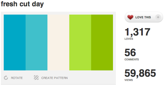
Because I can’t design, I decided to keep it minimalistic and to rely heavily on fonts and colors to handle my “design”.
If you need help with a font, there are a large number of them available via services like Google Web Fonts and Typekit.
If you need help selecting fonts, there are posts available where bloggers with design skills much better than mine do font pairings. I took their recommendation and used Lobster and Cabin.
The technical implementation of these fonts is simple as well.
To get access to these fonts, you only need to link the stylesheets in your header.
Once this has been done, the font becomes accessible for you to use in your CSS.
h1 {
font-family: 'Lobster', Georgia, Times, serif;
font-size: 70px;
line-height: 100px;
}
p {
font-family: 'Cabin', Helvetica, Arial, sans-serif;
font-size: 15px;
line-height: 25px;
}
That’s all it took to complete the design work.
I now have a framework, a nice color scheme, and two paired fonts to use for the content’s text.
Data-Driven Documents (D3)
D3 can range from exceptionally complex to very simple. There are a lot of visualizations you can create and their example gallery is a great start for demonstrating the types of content you can create. To keep it simple, I focused on charts and used NVD3. NVD3 helps create re-usable charts and chart components for d3.js. They have a number of examples and even live code demonstrations. To keep it simple, I tried to stay as close to the examples, simply copying the code directly into my content.
(After working on this, I’m now motivated to take a JavaScript course online, so I can really step up the graphs I can make.)
When you download NVD3, you’ll find a large number of example files packaged along with it. These will give you the framework to create most types of graphs or charts you’ll need.
Let’s walk through a simple graph to show how simple it is to implement.
To get started, you’ll want to link a number of JS and CSS files in your headers. To know which to use, just look in the header of the example you want to replicate.
<link href="assets/nvd-src/nv.d3.css" rel="stylesheet" type="text/css">
<script src="assets/lib/d3.v2.js"></script>
<script src="assets/js/nv.d3.js"></script>
<script src="assets/nvd-src/models/legend.js"></script>
<script src="assets/nvd-src/models/pie.js"></script>
<script src="assets/nvd-src/models/pieChart.js"></script>
<script src="assets/nvd-src/utils.js"></script>
<script src="assets/nvd-src/models/multiBarHorizontal.js"></script>
<script src="assets/nvd-src/models/multiBarHorizontalChart.js"></script>
I’m using a number of them here, because I used both pie charts and bar charts in my example. Once these have been added to the header, you now have access to all the tools needed to build interactive charts.
The actual HTML code is very simple. You just place a line like this in your HTML code where you want the chart to appear.
<div class="pie"><svg id="drinkmen"></svg></div>
This DIV and SVG tag pairing are replaced with a graph by the JavaScript.
Once this step is done, you have to create the JavaScript to pass the data and variables. This can be done in-line at the bottom of the page, or in an external file.
The first step is to assign your data to variables. Below you’ll see me storing the value pairs for the pie chart (yes/no) into drinkmendata. The only changes made out of the example here was customizing the variable name and changing the key and numeric values in the charts.
$(document).ready(function(){
var drinkmendata = [
{
key: “Yes”,
y: 61.56
},
{
key: “No”,
y: 38.44
}
];

var drinkwomendata = [
{
key: “Yes”,
y: 40.86
},
{
key: “No”,
y: 59.14
}
];
Next up, you’ll want to define the height and width of the graph. In addition, I added my own custom color group, which wasn’t part of the example. This will take two inputs and assign them to colors. I used the color codes from the color scheme I selected above. If you want more than two colors, change the “2” inside of range to the number of colors you want, then define that number of color codes in the last line.
var chart;

nv.addGraph(function() {

var width = 700,
height = 250;

var colorgroup = d3.scale.ordinal()
.domain(d3.range(2))
.range(["#40C0CB", "#AEE239"]);
This next chunk of code just comes right out of the example, with a small tweak from me. Within color, I used my own custom color group we defined above instead of the predefined color categories. This allows the graph to use our color scheme to match the rest of the design.
chart = nv.models.pieChart()
.x(function(d) {
return d.key }
)
.y(function(d) {
return d.y }
)
.margin({
top: 0, right: 0, bottom: 0, left: 0}
)
.values(function(d) {
return d }
)
.color(colorgroup.range())
.showLegend(false)
.width(width)
.height(height);
The last bit of code selects the ID of the HTML you want to replace and the name of the data variable.
In the code below, #drinkmen is the ID of the SVG we placed into the HTML and it will be replaced by the graph, and “drinkmendata” is the variable that contains the yes/no pie chart data we defined above. Other than that, the code is lifted right out of an example.
d3.select("#drinkmen")
.datum([drinkmendata])
.transition().duration(1200)
.attr('width', width)
.attr('height', height)
.call(chart);

chart.dispatch.on('stateChange', function(e) {
nv.log('New State:', JSON.stringify(e));
}
);

return chart;

}
And that’s it.
After making the pie chart, I went on to create two different bar charts, creating the basic framework for an interactive piece of content.
This took me a few hours to learn and build. The next time I do this, I’ll be able to spend less time learning and more time brainstorming content.
While working on this, I learned two little issues that are worth pointing out.
#1 – SVG doesn’t work well, or at all, in some browsers. You’ll have issues in IE 7 and 8. You should be OK in 9 and 10. In addition, some browsers, particularly FireFox and IE, have problems rendering SVG on hidden DIVs. If you try to render a graph in a DIV that’s to be toggled with jQuery, you may run into issues. It’ll cause the JavaScript to crash and none of the charts past that chart will load.
#2 – The pie chart had a huge height on an iPhone device. Setting the height in CSS for the DIV the wraps the SVG corrected this.
7 More Low Effort Technical Content Wins
In addition to tools like Bootstrap.js and D3, there are a number of frameworks, libraries, and hacks that allow you to quickly create interactive content. Below are 7 more technical ideas you can use to create higher quality content.
If you have coding skills, you can do a lot with these, but if you don’t, than challenge yourself to brainstorm content that works within the constraints of these tools with little customization. With a little bit of creativity, these can be used to create a wide range of content pieces.
#1 Polymaps
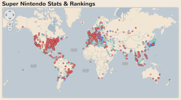
Polymaps is JavaScript library for making dynamic, interactive maps. It helps you create cool interactive maps, like this map on my friend’s site, which tracks the location of people favoriting Super Nintendo games on his site.
#2 CraftMap
CraftMap is a lightweight jQuery plugin to create an overlay, turning an image into map. Any image can be quickly turned into a map. If you think creatively, you could use it for images that aren’t maps, like object digrams, and use it for labeling. This could be used to plot conferences or events. It could show the top universities for a niche or the states with the highest salary. Or for example, a small local italian restaurant could use it to plot the vineyards of the various wines they serve.
#3 Scrollorama
Scrollorama is jQuery plugin for doing cool scrolly stuff. You’ve likely seen content pieces like the Slavery Footprint or Truckpocalypse. Both of these are using relatively simple JavaScript movements to move text across the screen. These type of effects can be replicated with a plugin like Scrollorama.
#4 Interactive SVG Infographics
Outside of libraries and plugins, keep an eye on JavaScript, CSS, and other types of coding / design blogs. They’re regularly posting quick and simple snippets of code (and tutorials) that allow for a range of engaging content. One example is this tutorial on creating an interactive SVG infographic. This tutorial is simple to follow and creates a simple, but creative timeline.
#5 Dingbats & Lettering.js
One of the more creative pieces I’ve seen using a JavaScript library used Lettering.js. Lettering.js is a jQuery plugin that gives you down-to-the-letter control over web type in ways that CSS doesn’t allow. Using Lettering.js, someone created a piece called a Dingbat Love Story. It used the Dingbat font and positioned the characthers on the page to create a cute and inspiring love story.
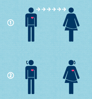
What makes this graphic so creative is the source code. Here is the HTML and text used to create this content piece.
<class="dingbats">qMpRRRRRRFwMJpFJpeMsrFttMppprFpppypMFuBBB
That’s the whole infographic.
What appears to be random characthers are converted to symbols / icons using the Dingbat font and are positioned on a per character basis using Lettering.js.
#6 JavaScript slider for interactive graphs
OKTrends is complimented for the interesting and data intensive posts that they use to publish. In addition to sharing amazing insights, they created content that was unique in its interactivity. I thought it would be useful to package up some of this functionality. In their post about the biggest lies told in online dating, they used a clever interactive slider that changed graph data based on age.
A quick peak into the source code shows that this is a very simple image swap script. I pulled out all the pieces needed to replicate this.
This script works by taking a folder of images named 18 to 54 and changing the file’s name when you move the slider. The slider handle and scale are simple images offset by a z-index. And it has a preload to prevent lag/flicker when swapping images. It’s a really simple system to replicate.
Here is the full source:
<html>
<head>
<script src="http://ajax.googleapis.com/ajax/libs/prototype/1.6.1.0/prototype.js" type="text/javascript">
</script>
<script src="http://ajax.googleapis.com/ajax/libs/scriptaculous/1.8.3/slider.js" type="text/javascript">
</script>

<style>
/*

The code used for graph sliders on OKTrends.

Example:
http://blog.okcupid.com/index.php/the-biggest-lies-in-online-dating/

<3 OKTrends

*/
.track {
background-color: #fff;
position: relative;
height: 0.5em;
cursor: pointer;
z-index: 0;
width: 474px;
margin-top: 2px;
}
.handle {
background-color: none;
background-image: url('http://akcdn.okccdn.com/blog/older_lover/slider_pointer.png');
position: absolute;
height: 19px;
width: 15px;
cursor: move;
z-index: 2;
}
.label {
text-align:left;
font-size: 13px;

font-family: calibri, verdana;
color: #4e4a35;
}
img.no_display {
display:none;
}
</style>

</head>
<body>

<div class="slider_container" style="margin-bottom:40px;">

<img id="map" src="http://cdn.okcimg.com/blog/lies/income_slides2/18.png" style="margin-top: 10px;">

<div id="track1" class="track" style="margin-left:10px;">

<div id="handle1" class="handle">
</div>

</div>

<div class="label" style="margin-left:10px;">
<img src="http://cdn.okcimg.com/blog/lies/scaleD.png" >
</div>

</div>

<script type="text/javascript">

var mySlider;
var ext = ".png";
var root_dir = "http://cdn.okcimg.com/blog/lies/income_slides2/";
var num_images = 54;

window.onload = function() {
mySlider = new Control.Slider('handle1' , 'track1',
{
range: $R(18,num_images),
sliderValue: 1,
onSlide: function(v){
var img_name;
var dir_name;

// map slider value to img names
img_name = v;
img_name = Math.floor(img_name);

$('map').src= root_dir + img_name + ext;
}

}
);

mySlider.setValue(18);
}

</script>

<script>

function preLoadImages() {

var str;

for (var i = 17; i < num_images; i++) {

var img_index = i + 1;

str = "<img src='" + root_dir + img_index + ext + "' class='no_display'/>";

document.write(str);
}

}

preLoadImages();

</script>
</body>
</html>
#7 jQuery Gender Toggles
One creative use of jQuery on OKTrends is the use of gender icons to toggle and compare data for male and females. Comparing data, graphs, and tag clouds between two different sets of entities is a simple content type. Male and female comparisons are easy examples, but this could include years, brands or even people. OKTrends used this type of toggle to compare tag clouds of interests in their post about the real stuff white people like.
I was able to build this myself with some simple code.
The code is simple as well.
<html>
<head>
<script type='text/javascript' src='http://code.jquery.com/jquery-1.9.1.js'></script>
<script type='text/javascript'>
$(window).load(function(){
$('#toggle > span').click(function() {
var ix = $(this).index();

$('#left').toggle( ix === 0 );
$('#right').toggle( ix === 1 );

}
);
}
);
</script>
<style>
/*
Code to replicate gender toggle on OKTrends

Example:
http://blog.okcupid.com/index.php/the-real-stuff-white-people-like/

<3 OKTrends
*/
#right { display:none; }
</style>
</head>
<body>
<div id="left">Male Content</div>
<div id="right">Female Content</div>

<p>Use icons below to toggle between men and women.</p>
<p id="toggle">
<span><img src="img/male.png"></span>
<span><img src="img/female.png"></span>
</p>
</body>
</html>
More to Being a Technical SEO than Technical SEO
As the demands of SEO grow, there is value in rethinking what we mean by “Technical SEO”. Being successful in a world of complex, and often interactive, content means closing the skill gap and pushing ourselves rapidly out of our comfort zones.
[And I’d like to say thanks to SearchFest for having me out and for the room full of individuals kind enough to listen to what I had to say. SearchFest this year was one of the most enjoyable events in my career, not really for the content (although that was great), but because of the amazing people (and supporting community) down in Portland.]

Awesome post Justin!
This is really timely, for me. I wanted to do a piece of content that I can do, to minimize the time and effort that my team is going to spend. I am trying to avoid guest posting (not that I don’t think it helps), but I truly believe that good content pieces are wasted if it’s not on mine or on my client’s site.
Although most of these are technical (still haven’t grasped the concept on the gender toggles), I’ll try to follow your examples and see what I can come up with.
Thanks for sharing this!
I really liked this post as it shows what is now possible for someone with a mild technical background. I think half the battle is knowing where to find the tools to make things easier and keeping up with how different technology can empower you.
A JS tool i keep meaning to look at is: impress.js which allows you to do interactive presentations in javascript, CSS etc i think that could make some intresting “content”
Images with text haters unite! Every time I see text in an image I cringe.
Great post. I also just wrote about “using real text and web fonts and not just images” in a recent post talking about basics that web developers should know.
Keep up the fight :]
Great post! What blogs do you recommend I follow to see the latest Javascript designs/codes?
Awesome post Justin! This is an incredibly powerful and relatively low resource/low effort to implement. Creating these data driven pages in conjunction with a surveymonkey or google customer survey data set can create some very link-worthy and powerful content pieces. Thanks for sharing!
Very cool! It’s awesome you knocked that out in 4 hours. Thanks for sharing. Love the tips about design too–your stuff looks great.
Just to reiterate your point, and even for those of us that are less technical, there are various tools out there that require even less know-how like http://infogr.am/.
So even if you’re just a blogger looking to create better content, you can look up various infographic tools.
This blew my mind – thank you! I run a small writing agency and we’re trying to find ways to produce visual content to go along with our original pieces. This is great!
Thanks Justin as always for taking the time to share your work and thoughts. Having come to SEO as someone who originally started out with a passion for front end web development I can certainly appreciate your thinking here and challenge issued to bring our skills up.
My reaction (partially based on my own experience) is that SEO is going to get divided into two groups (as much of marketing and specifically web/digital/inbound marketing has) – you are either going to come at things from a technical angle and be solid at that, which will include skills like those you’ve displayed, as well as a deeper understanding of programming and how to build tools and perform technical analysis on a site, or, you’re going to be an SEO that falls into the off-page arena and you’ll specialize in creative concepts, building connections, identifying opportunities and helping groups within organizations work together to achieve SEO objectives.
The two circles certainly overlap in my mind and I think you hit a spot where they do. Even if you never actually build out content using these skills, having the understanding of how they work will make you better at being an SEO and a marketer in generally. I believe understanding the tools available to use is crucial to success.
All that to say thanks again for sharing and for the detail!
Loved this post, Justin – great explanation of an approach that many would find too daunting before they see the steps and realize how powerful libraries can make this kind of thing not easy but achievable without massive overhead.
But it gets right back into the SEO identity crisis for me. I would call this dev/production, NOT SEO. This is essentially front-end coding.
I wouldn’t suggest SEOs can’t/shouldn’t learn to do this kind of work, but I question whether this is what we’re hired for. Given avg hourly rates for a SEO Consultant, does it make sense for clients pay them to (less efficiently) do the work a junior-level front-end coder can do for less?
I re-watched Tom’s MozCon talk this weekend as it’s been sticking in my craw (saw you included it in your deck) and found myself thinking hard on this issue. No solution to my mind mind when it comes to off-site/authority – as search engines evolve, the rightful role of the SEO in this realm diminishes. We don’t need search engine strategies, we need people strategies.
I’d love to create a page like Truckpocalypse. These are some really great ideas. It is content that i’d love to create and content that’d i’d love to see more of.
Great post Justin, really great read. This is a really a nightmare for some and you have layed it out for the non technical people including myself.
Understanding of programming is not easy by any means there are tools out there that make things easier while building info graphics.
Thanks Justin
Danny