Graph theory is fundamental to most of the work done in SEO and social media. Everything from PageRank, EdgeRank, spam analysis, clustering, and implicit / explicit social graphs are all built on graph theory. Although successful SEO can be executed without ever knowing the difference between a node and an edge, a basic understanding of graph theory can help an SEO make the intellectual leap to better understand how search engines can view and analyze data.
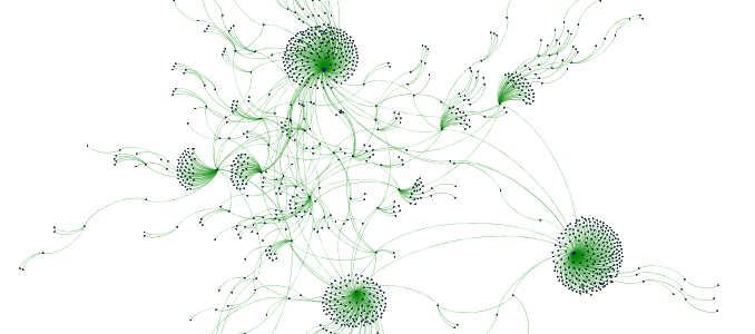
The graph above is a visualization of the link profile of a site in my niche, crafted in a nifty program called Gephi. I first mentioned Gephi back in my SearchFest presentation in Portland and again in my LinkLove presentation in Boston. I have been meaning to show how I got this graph. In this post I’ll guide you step-by-step through making an anchor text to target page directed graph, using data from Open Site Explorer.
Basics of Directed Graphs
A directed graph is a simple concept. Below is a diagram of a directed graph from my post on Link Based Spam Analysis.
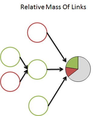
A directed graph has both nodes (sources and targets) and edges (connections between nodes). Edges can pass in one or both directions as well. In addition, both nodes and edges can carry various weights.
For example, a link from one page to another could be represented as an arrow with a thickness determined by the PA of the linking page. An Open Site Explorer export is just directed graph data in CSV format. All exports have anchor text (source) and the target url (target), which define nodes. In addition that, each connection has additional data such as linking root domains, number of links, DA, and PA. These can all be used to weight the connection between the nodes, as well as weighting the nodes themselves.
What This Graph Is Showing Us
These graphs can appear a bit daunting at first glance, but they’re all interactive within Gephi. This can allow you to apply labels and hover over various nodes. But let’s do a quick run down of what can be seen in this graph.
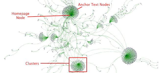
There are a few primary features in this graph.
- Target URLs and anchor text are represented by blue nodes.
- The size of the node is determined by the InDegree (number of edges pointing into it), so stronger nodes have larger circles. You can also use metrics like PA, DA, LRD as attributes of nodes, so they scale by those metrics instead of just InDegree and OutDegree. That takes a little more work than I’m showing in this post.
- The connections are represented by green lines, representing the hyperlink reference connection between the anchored link and the target page.
- All of the anchors that share the same target URL cluster around the target URL node.
All of the features like color and node sizes are customizable, so if you don’t like my colors here, no worry, it can be changed in Gephi.
The clustering is fairly powerful. In this example, it highlights something interesting.
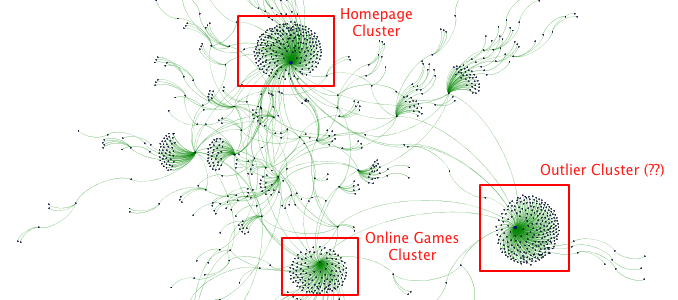
To nobody’s surprise, the homepage node is the strongest, most well-connected node. Most sites will follow this pattern, as most links tend to point to a site’s homepage. Sites with better deep linking will see a series of smaller, but larger number of clusters. In this case, there are two other pages that are strong hubs on the website. The one at the bottom is the Online Games page on this site, which is hierarchical hub on this site and has had a strong external link building campaign executed against it. It’s a strong page, but as you can kind of see in the graph, the center node is not as prominent as the homepage.
However, off to the bottom right is a very strong node that is nearly as strong as the homepage. It shares few anchors with the rest of the site, and therefore shot out to the side a bit. It’s clustered on its own, far away from the homepage. What is causing this?
This particular site purchased a strong pre-owned domain and 301 redirected it to a subpage on the site. Both the subpage and pre-owned domain are on the same topic, and it was a legitimate acquisition, but the pre-owned domain developed for years independent of the company that finally purchased it. Because of this, it shares few branded and targeted anchors with the rest of the pages on the site. The tactic is working really well for this site, but a graph like this shows how easy it is for search engines to detect unnatural linking behavior.
How to Visualize Open Site Explorer Data Using Gephi
Start by going to Open Site Explorer and exporting out a CSV of the backlinks to the domain of your choice.
Step One: Get the data ready
Open the CSV in Excel, change Anchor Text to Source and Target URL to Target. You can keep all the data in the CSV, but I deleted the superfluous data relating to the links just to simplify the example. I left the following data.
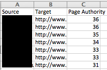
This is showing the Anchor Text -> Target Page relationship, but the edge relationship can be crafted in different ways. For example, you can show Linking Page -> Anchor Text, Linking Page -> Target Page, and Domain(s) -> Domain(s).
When working in Excel, be careful to not let Excel add empty rows of data into your CSV. You can avoid this by editing it in a text editor.
Step Two: Data Laboratory
In Gephi, you’ll see a button that the top that says Data Laboratory, click that.
![]()
Step Three: Import data
From here, you can import your CSV.
![]()
Step Four: Set input attributes
There are two steps to the import process. Set “As table” to “Edges table”. You can import Node tables separately, but that’s for another post.
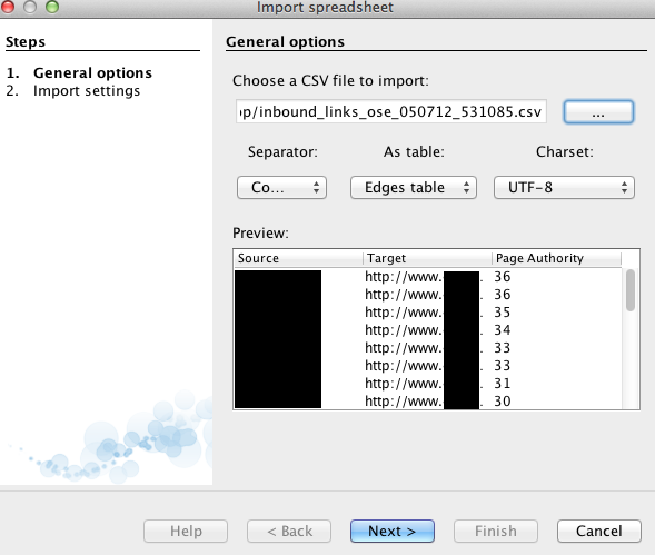
For more information, here is some information from Gephi on CSV formats and some example data someone put on Github.
Step Five: Set data types
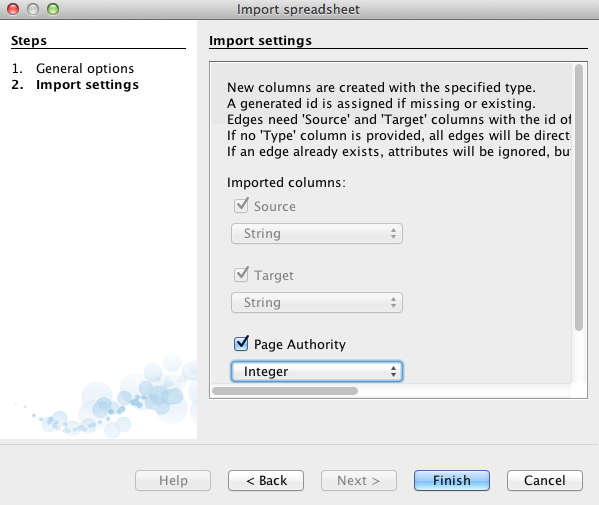
Depending the amount of data you pull in, you’ll want to specify the data type for each. You can set numbers to something like Integer or Float, and labels and text to String. Once it’s imported, you may want to click over to Nodes under Data Laboratory and copy the Id column into Label, to easily show labels when previewing.
Step 6: Go back to Overview
Once imported, you can click over to Overview and you’ll see your data represented as a blob of connected dots. We’ll need to run a Layout Algorithm to properly spread out all of these nodes.

Step 7: Run Layout algo
I’ve had success using Yifan Hu when playing around with Open Site Explorer data. ForceAtlas is also a good layout for some types of data.
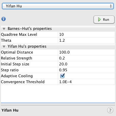
When you click a layout, it will either keep running for a long time and you can stop it when satisfied, or it runs to completion and can be run again over and over to get your desired results. If you decide to show labels in Overview mode, there is an Adjust Labels layout that will shake your nodes around making room for labels. It’s worth checking out the GUI wiki page to learn about all of the different features available, as it can be a bit daunting.
Once you run the Layout, you’ll get something closer to this.
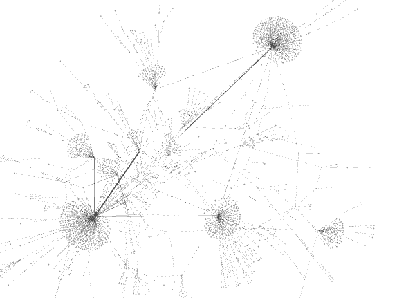
Step 8: Set styling
Up at the top left side, you have a tab that says rankings. You can use this to adjust colors and size (and label color and size) based on InDegree, OutDegree, and other metrics you pulled in to define the Edges or Nodes. The color wheel changes color and the red diamond changes the size. You set the settings you want, then click apply, then go to the next feature, set, then hit apply. (It’s behavior is a bit wonky, so it takes some time to get it to look how you want.)
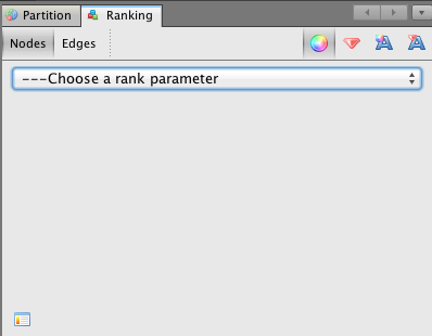
You’ll notice that your Overview never looks quite as pretty as the graphs at the start of this post.
Make it Pretty
If you go over to Preview (next to Data Laboratory tab), there is a whole set of features to make it pretty. I switched over to Preview and used Default Curved and hit refresh. Then below that you have a ton of settings to change colors and other visual features.
For example, I went into Google Analytics and exported a report showing keyword to URL traffic. I set the keyword as source and the URL as target, then repeated the steps above. Once over in preview, it looks a bit like this (I muddied up the data a bit, so this isn’t exactly reflective of the traffic to the site.)
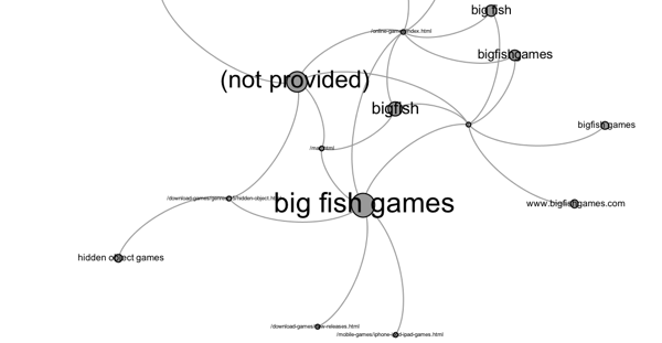
With this graph, I can visualize the distribution of traffic by keyword to the pages it lands on. This can identify instances of double listings, site links, and personalization.
What can you get from these graphs:
- Clusters – The most powerful feature is clustering, where like nodes group together in relationships and various factors can be used to define those relationships. For example, stronger connections can result in stronger, closer clusters, and lower connections result in more repulsion. These clusters can show valuable “sources” and “sinks” in a particular graph.
- Strong Anchors (Keywords) – You can scale anchors by OutDegree, to show which anchors are linking to many pages, or I can use SEOmoz metrics to scale nodes.
- Strong Pages – You can scale pages by InDegree, to show which pages have many links coming in, or receive traffic from many different keywords.
- Outliers – Along with clustering, you’ll be able to identify outliers, which cluster away from the rest of the graph. In the main example I gave, a 301 redirected pre-owned domain appears as an outlying cluster.
- Scale by value – With a little more work, edges and nodes can be scaled by link metrics like PA or DA, so that the size of the circle or boldness of the arrow scales with the value being passed through the link.
- Competitive link analysis – It can be used in competitive link analysis to show shared links, similar to the example SEER gave in their awesome post on how to do graphing with Fusion Tables.
- Internal linking – I haven’t tested yet, but I’m sure you could combine this with something like Joshua Titsworth’s post on using Screaming Frog and Excel to visualize internal link data, but put that type of stuff into Gephi.
- Social networks – You can scrape or export social data, tweet streams, or #hashtag searches to visualize the connections and tweets between users.

Great post & very timely as I only downloaded it yesterday (to use with Xenu data). Have you also tried nodexl.codeplex.com/ ? Darroch
Wow! This looks great, can’t wait to try it out. Cheers Justin 🙂
YESSSS! Now we need a e-book from you on Link Theory.
-Mike
I agree with the statement that “SEO can be executed without ever knowing the difference between a node and an edge” but boy, it does make a difference.
I guess the best feature of Gephi (apart from being open-source and free) is the fact that it is interactive.
Knowing nothing about Gephi, I thought I would give a try downloading it and following your instructions.
I came across 2 snags in my adventure thus far:
1. I found that you need to have the ‘create missing nodes’ check box checked, or else no data will appear in the Data Table section (only the column headers will show otherwise.)
2. I see the lil’ ball of link data joy in the Overview screen and I have applied the Yifan Hu layout successfully. However, when I go to the Preview window, nothing appears. I have tried to apply the Default Curved preset in the Preview Setting box that you mentioned, and I hit Refresh too, to no avail.
Any suggestions on what I might be doing wrong in snag #2 described here?
Aha,
I figured out that in order to see the link graph within the Preview section, I had to choose ‘preview’ in the ‘Window’ drop down in the program’s main menu.
I can now see the graph.
Russ
Great stuff Justin as always.
Visual representations of internal/external linking are can detect several anomalies in the link graph. I really liked the example of the 301 redirected domain and the argument that it wouldn’t be difficult for a search engine to detect this kind of practice. However, in many cases it seems that such practices still go undetected.
Also, visualizing the distribution of traffic by keyword to the pages is just spot on!
This post is just AWWWful 🙂 man awesome insights BTW this need huge knowledge to understand the graphs but you guide a lot in this post Thanks Justin
Nice work Justin. Been trying to figure out Gephi myself, so glad I found this. Thanks for the step by step instructions.
This is fantastic – I know what i’m going to be doing this weekend!
Awesome Justin! Think You fried my brain a little there but I’m looking forward to testing this out. Cheers!
If you wish for to get much from this piece of writing then you have to apply these
methods to your won website.
Great post!
Thank you 🙂